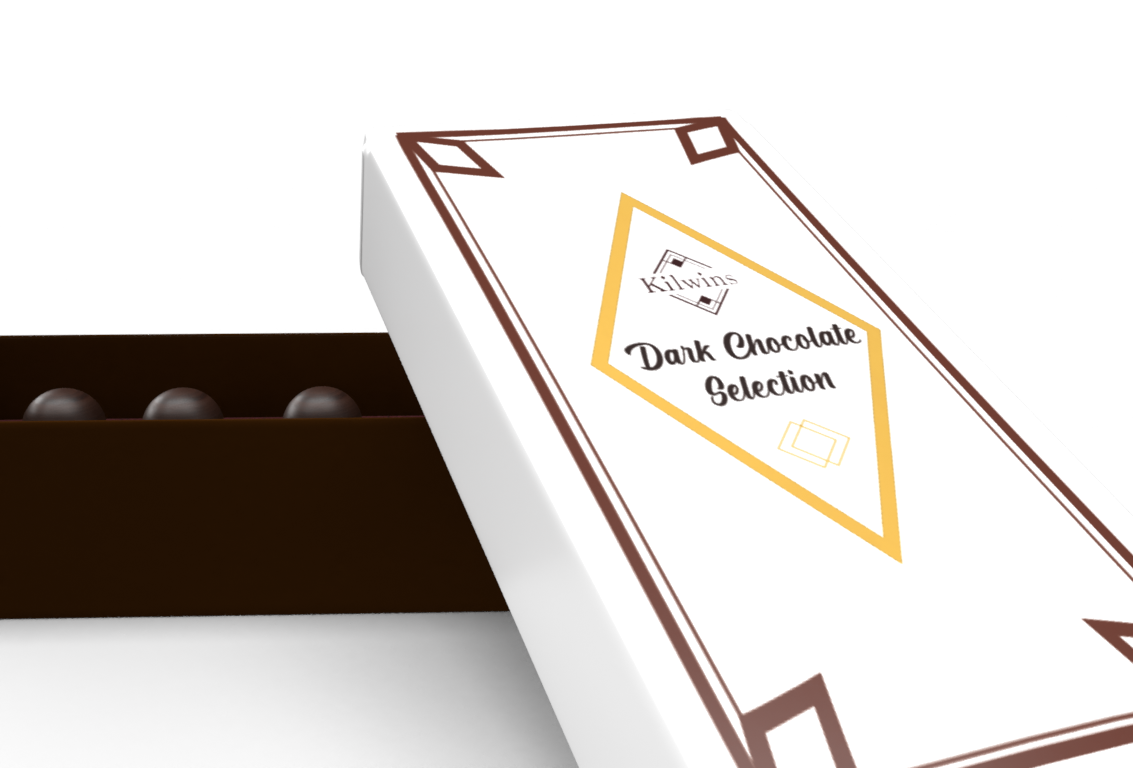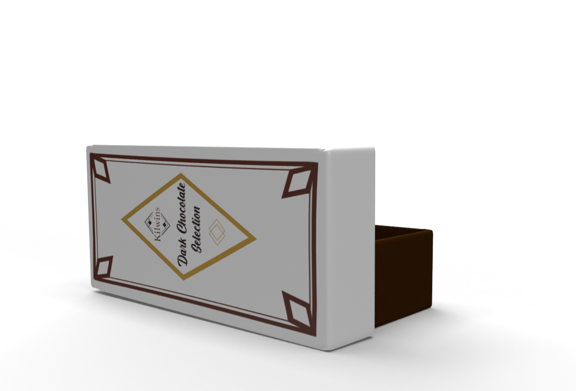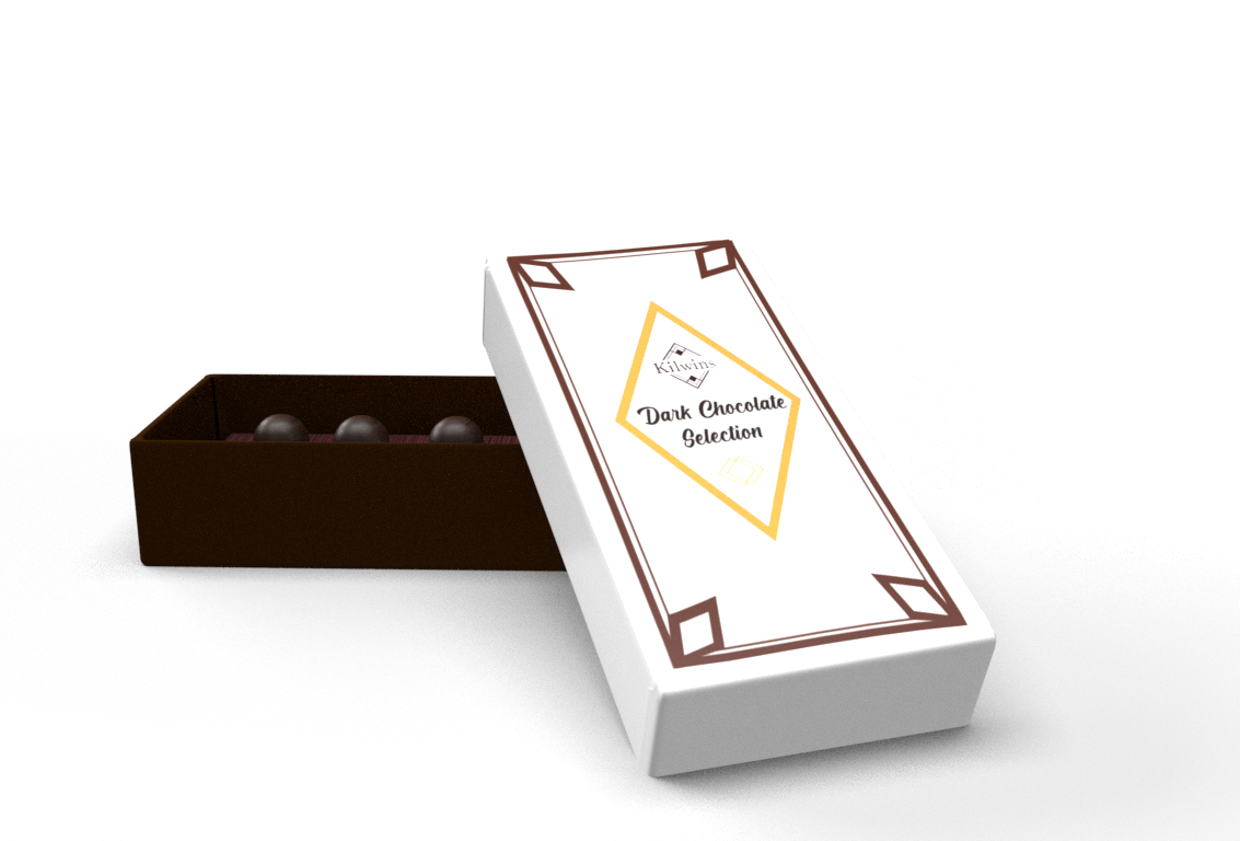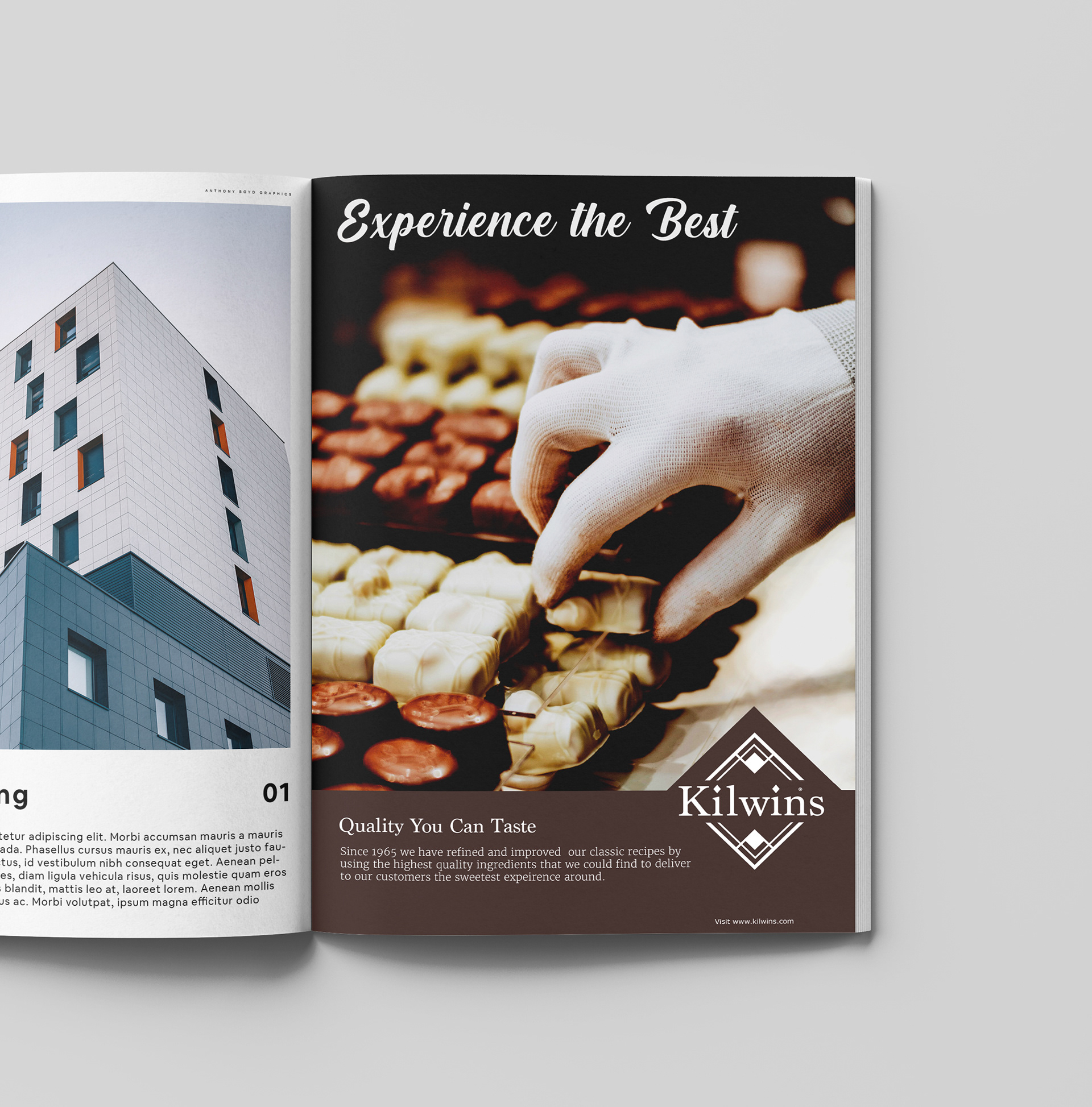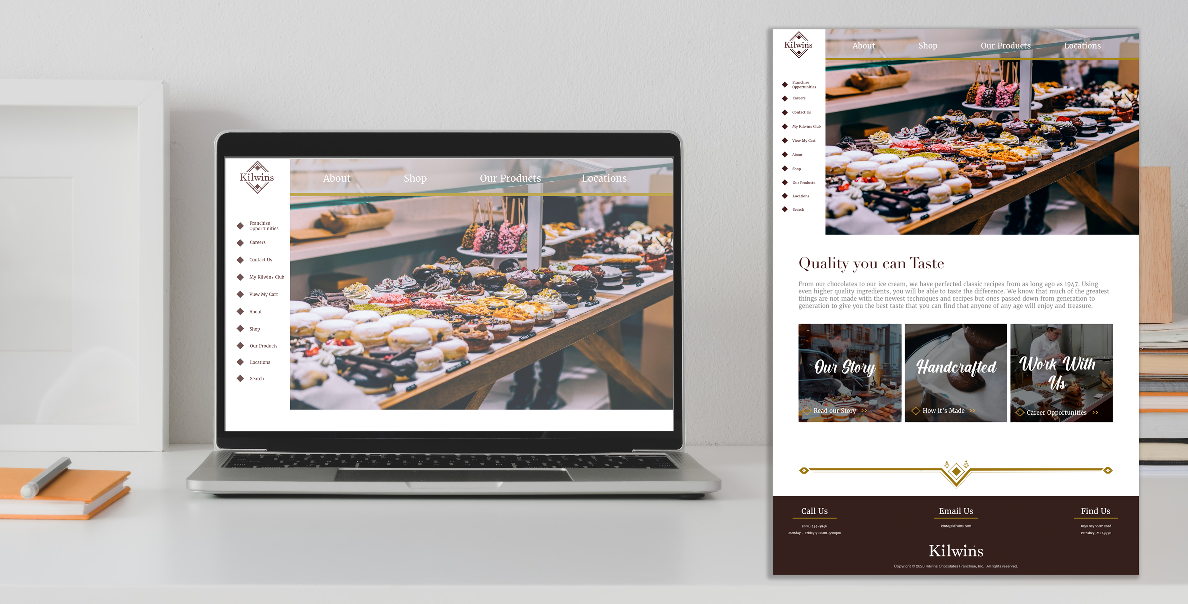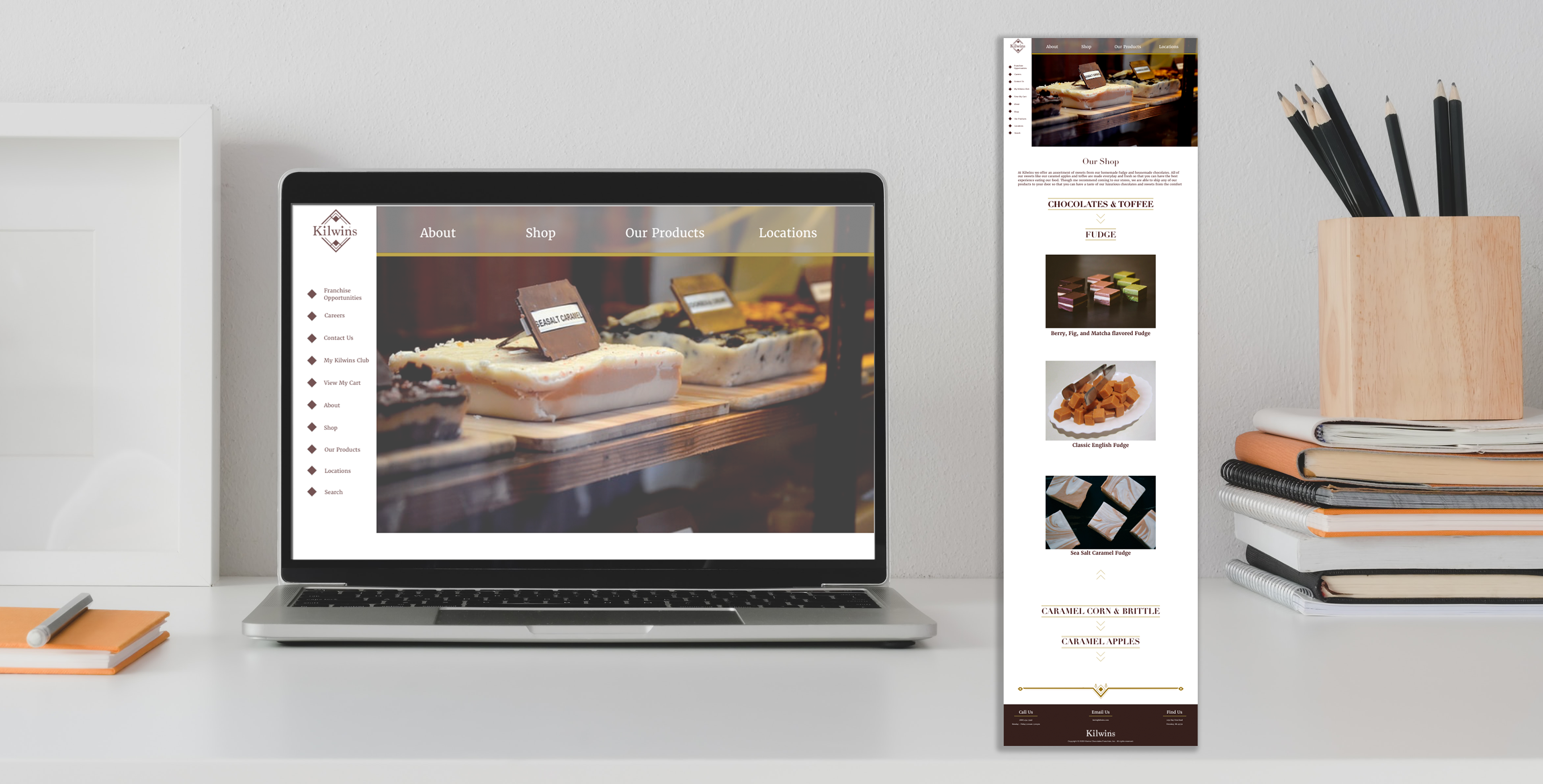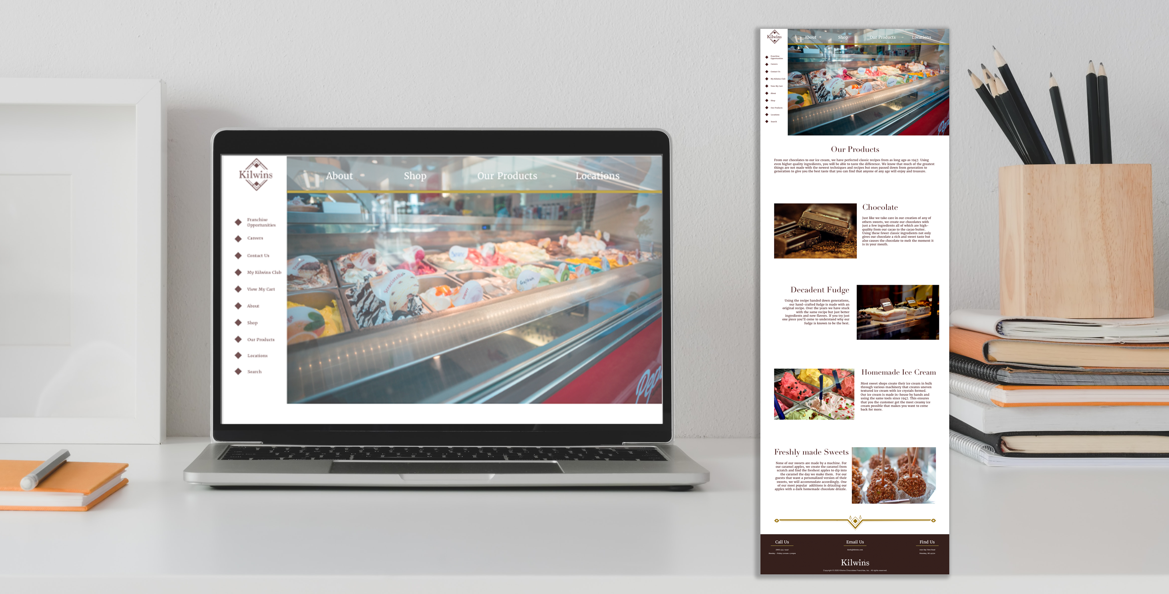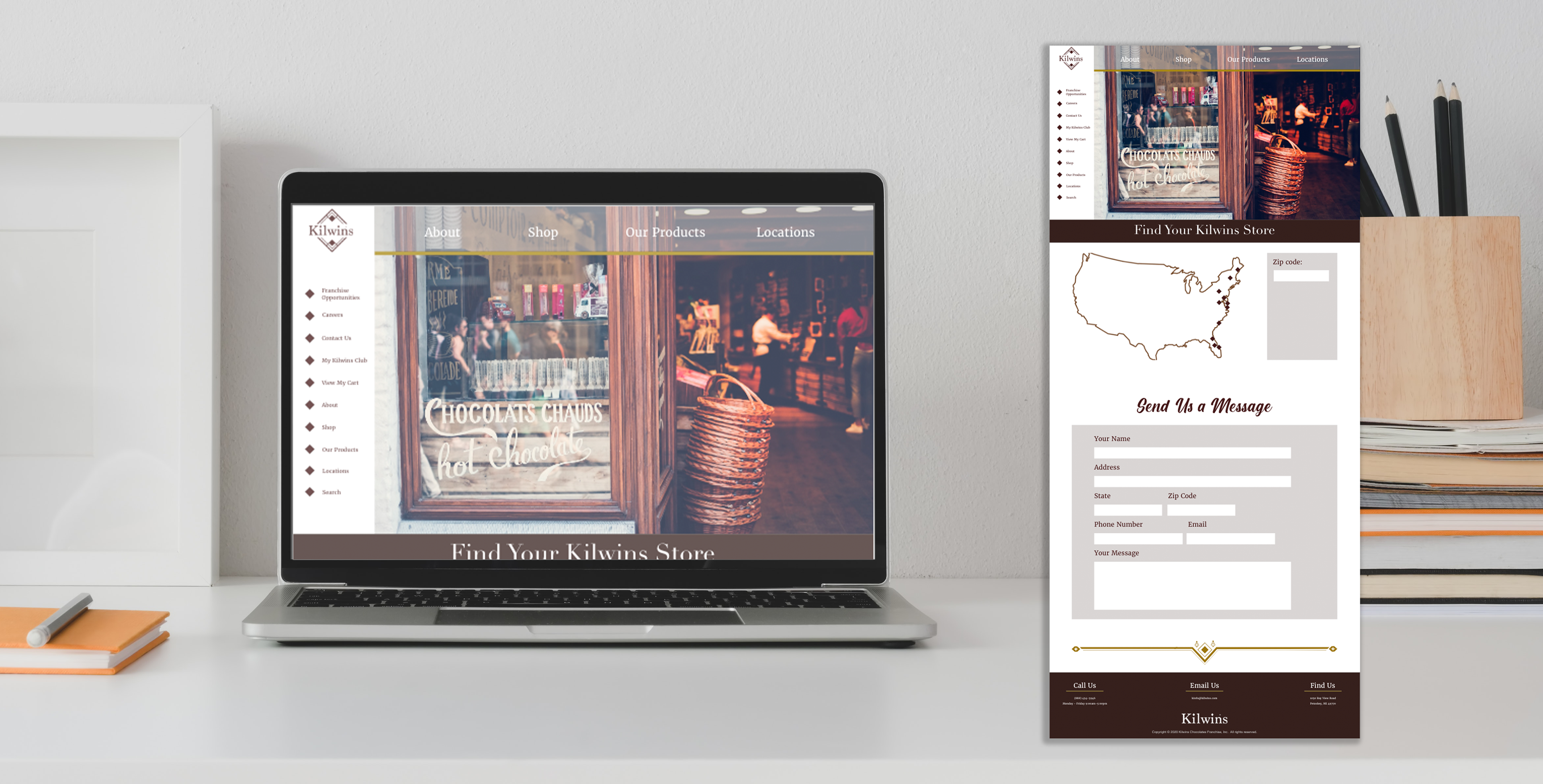
I decided to make a completely new look to the branding where instead of Kilwins presenting itself as more old-fashioned and classic, Kilwins is more refined and has an elevated and expensive look to it. In my version of the Kilwins branding I wanted to stick with how the chain has used old passed down techniques but show it in more of a sense that those techniques have been perfected and mixed with the best ingredients to provide for an upper class clientele.
Throughout my branding I chose to focus on the diamond aspect of the original logo and brand and use it overapping in small line weights as a design element in repitition and design along with white space and nice photography.