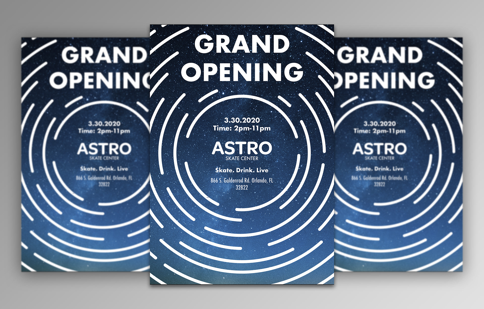
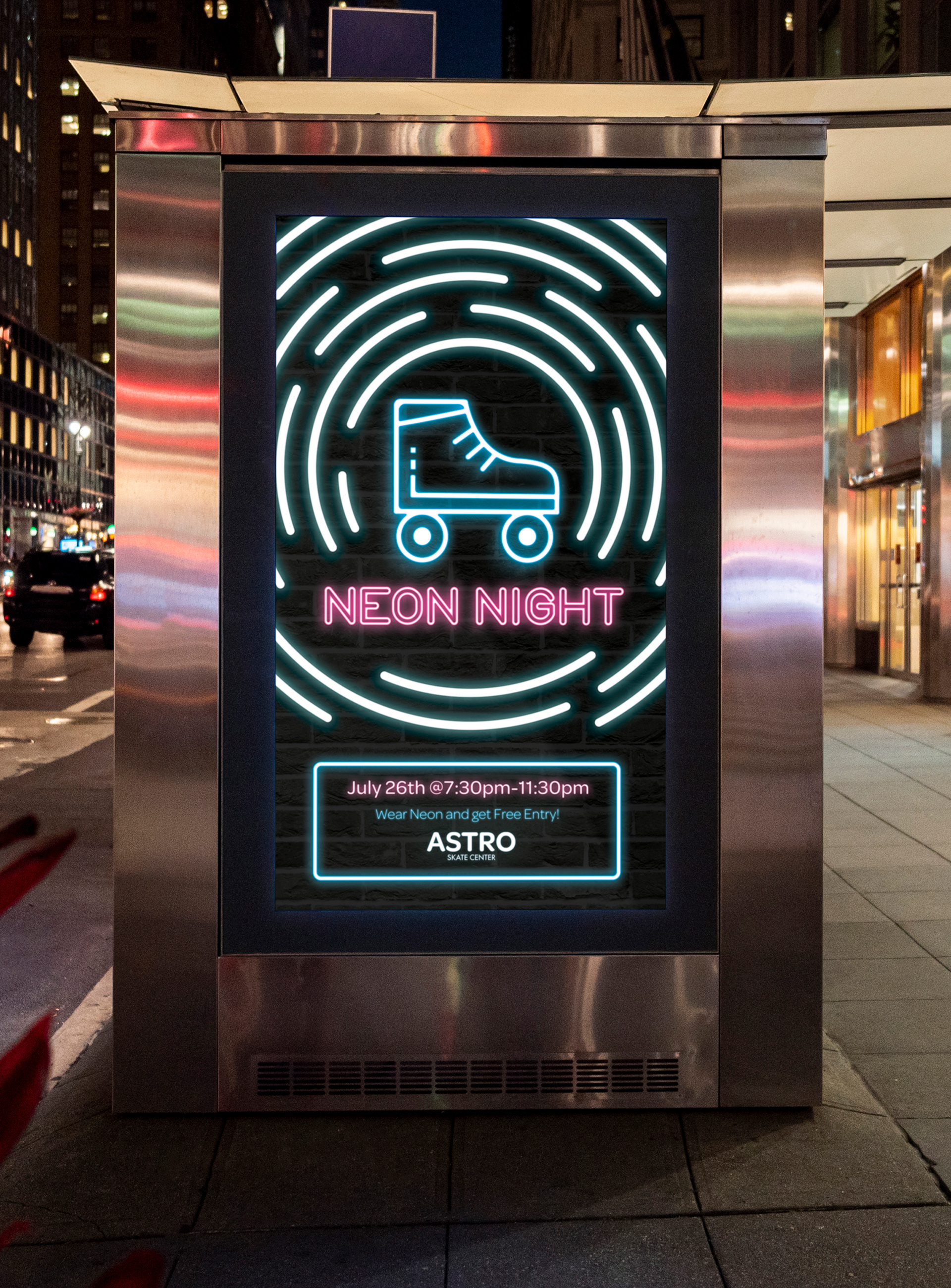
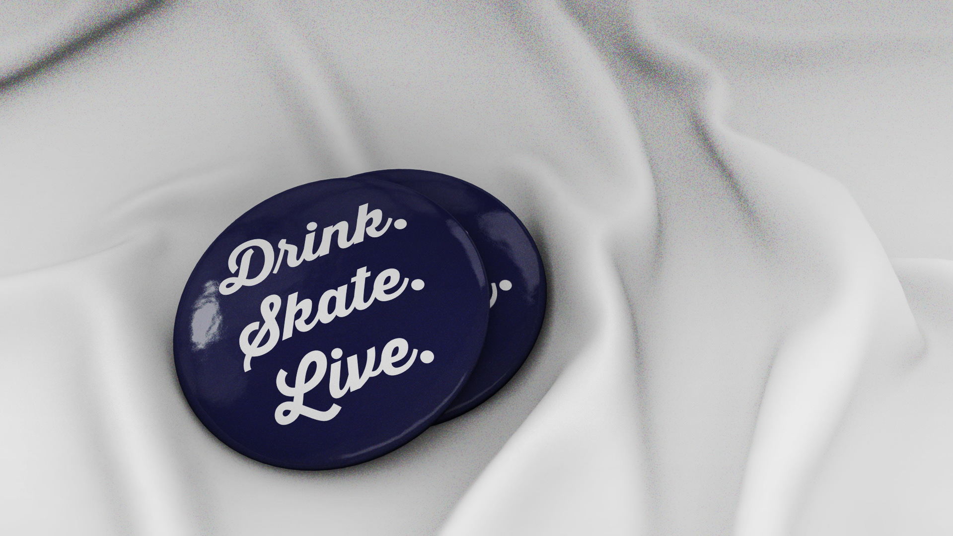
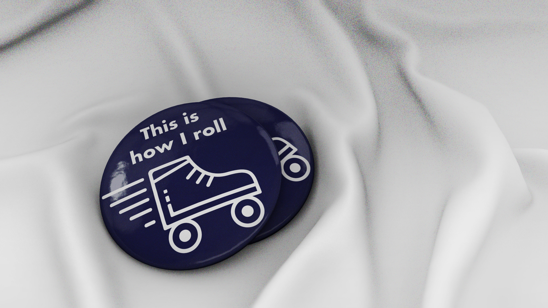
I chose to rebrand the Astro Skate Center to appeal more towards a young adult/college student group instead of the original branding made for kids and families. I wanted my rebrand to be centering on the skate center closing for remodeling to appeal to their new target audience with even adding a bar inside, which is referenced by some of my pin designs below.
I wanted to create an interesting and flexible logo with a design that can be used throughout the brand’s advertisements and merchandise. I stayed with the space theme but presented it in a more cool and retro look.


